| | Guild Logo/Symbol |  |
|
+8Caryington PrioryJK The Partisan Kol Charada Lunarwolf Harlequin2 Sureshot 12 posters |
|
| Author | Message |
|---|
PrioryJK
Special Agent


Number of posts : 2575
Age : 37
Location : UK Hull
Registration date : 2009-05-01
| |
| | |
Caryington
Veteran Agent


Number of posts : 2420
Age : 41
Location : Watching you...
Registration date : 2010-03-07
| | Subject: Re: Guild Logo/Symbol Sun Jun 13, 2010 4:37 am | |
| | |
|
| | |
Randomfest
Freelancer


Number of posts : 355
Age : 35
Location : PA
Registration date : 2010-06-02
| | Subject: Re: Guild Logo/Symbol Sun Jun 13, 2010 4:53 am | |
| yeah looks good =o great job  | |
|
| | |
Harlequin2
Veteran Agent

Number of posts : 1887
Age : 29
Registration date : 2009-02-25
| | Subject: Re: Guild Logo/Symbol Sun Jun 13, 2010 5:24 am | |
| Ah! That is awesome! Amazingly good job there Priory! I reckon we could put it on our front page. The only bit of work that I think it needs is the arrowhead pointing down at the bottom. I really think it gives it that edge and not just because I came up with it. I envy your prowess with that program though. I believe the phrase is "Skills that kills" | |
|
| | |
Commander Nord
Freelancer
Number of posts : 1761
Age : 39
Location : Norway
Registration date : 2009-03-24
| | Subject: Re: Guild Logo/Symbol Sun Jun 13, 2010 5:34 am | |
| | |
|
| | |
Sureshot
Chief Operative

Number of posts : 5209
Age : 47
Location : Reading, England
Registration date : 2009-02-11
| | Subject: Re: Guild Logo/Symbol Sun Jun 13, 2010 6:31 am | |
| Very nice indeed! Love both of them. To be honest I don't think any of it really needs changing. | |
|
| | |
The Partisan
Registered

Number of posts : 66
Age : 33
Location : Cardiff, United Kingdom
Registration date : 2010-04-03
| | Subject: Re: Guild Logo/Symbol Sun Jun 13, 2010 6:33 am | |
| Epic work, PJK. That's a guild seal to be proud of. | |
|
| | |
PrioryJK
Special Agent
Number of posts : 2575
Age : 37
Location : UK Hull
Registration date : 2009-05-01
| | Subject: Re: Guild Logo/Symbol Sun Jun 13, 2010 6:36 am | |
| - Sureshot wrote:
- Very nice indeed! Love both of them. To be honest I don't think any of it really needs changing.
Though luck, it is  | |
|
| | |
Harlequin2
Veteran Agent
Number of posts : 1887
Age : 29
Registration date : 2009-02-25
| | Subject: Re: Guild Logo/Symbol Sun Jun 13, 2010 6:59 am | |
| Actually, turn it so that the three spikes are pointing upwards. I think that looks better. | |
|
| | |
PrioryJK
Special Agent
Number of posts : 2575
Age : 37
Location : UK Hull
Registration date : 2009-05-01
| | Subject: Re: Guild Logo/Symbol Sun Jun 13, 2010 7:26 am | |
| - Harlequin2 wrote:
- Actually, turn it so that the three spikes are pointing upwards. I think that looks better.
$$$? | |
|
| | |
PrioryJK
Special Agent
Number of posts : 2575
Age : 37
Location : UK Hull
Registration date : 2009-05-01
| | Subject: Re: Guild Logo/Symbol Sun Jun 13, 2010 7:39 am | |
| - The Partisan wrote:
- Epic work, PJK. That's a guild seal to be proud of.
Well I'm just playing with Harls idea I dont deserve all the credit......just 60% credit  | |
|
| | |
nosyd
Freelancer

Number of posts : 435
Age : 53
Location : Waddington - Lancashire - England
Registration date : 2009-06-06
| | Subject: Re: Guild Logo/Symbol Sun Jun 13, 2010 8:59 am | |
| That is looking pretty good, like it a lot. | |
|
| | |
Harlequin2
Veteran Agent
Number of posts : 1887
Age : 29
Registration date : 2009-02-25
| | Subject: Re: Guild Logo/Symbol Sun Jun 13, 2010 9:14 am | |
| Well, give it a shot with the arrow, see what you all think... | |
|
| | |
Lunarwolf
Chief Operative

Number of posts : 6401
Age : 44
Location : Southampton, UK
Registration date : 2009-02-23
| | Subject: Re: Guild Logo/Symbol Sun Jun 13, 2010 10:06 am | |
| I'm in Lurve.
Lets keep 'em! | |
|
| | |
PrioryJK
Special Agent
Number of posts : 2575
Age : 37
Location : UK Hull
Registration date : 2009-05-01
| | Subject: Re: Guild Logo/Symbol Sun Jun 13, 2010 11:16 am | |
| | |
|
| | |
nosyd
Freelancer
Number of posts : 435
Age : 53
Location : Waddington - Lancashire - England
Registration date : 2009-06-06
| | Subject: Re: Guild Logo/Symbol Sun Jun 13, 2010 11:37 am | |
| For me you can lose the bottom arrow. I also prefer the three spikes pointing sideways instead of up. | |
|
| | |
Lunarwolf
Chief Operative
Number of posts : 6401
Age : 44
Location : Southampton, UK
Registration date : 2009-02-23
| | Subject: Re: Guild Logo/Symbol Sun Jun 13, 2010 12:36 pm | |
| Looks better sideways in my opinion, looks like an "E" that way As for the down-arrow? I personally kinda like it - for personal preference I prefer the detached one. | |
|
| | |
Harlequin2
Veteran Agent
Number of posts : 1887
Age : 29
Registration date : 2009-02-25
| | Subject: Re: Guild Logo/Symbol Sun Jun 13, 2010 12:49 pm | |
| Awesome rendering there PJK! I personally like the second one, more so because it was my brainchild | |
|
| | |
Kleti
The Praxeum

Number of posts : 448
Registration date : 2010-06-28
| |
| | |
Sureshot
Chief Operative
Number of posts : 5209
Age : 47
Location : Reading, England
Registration date : 2009-02-11
| | Subject: Re: Guild Logo/Symbol Tue Aug 24, 2010 6:59 am | |
| I agree, I really like that design. | |
|
| | |
Caryington
Veteran Agent
Number of posts : 2420
Age : 41
Location : Watching you...
Registration date : 2010-03-07
| | Subject: Re: Guild Logo/Symbol Tue Aug 24, 2010 6:59 am | |
| | |
|
| | |
Lunarwolf
Chief Operative
Number of posts : 6401
Age : 44
Location : Southampton, UK
Registration date : 2009-02-23
| | Subject: Re: Guild Logo/Symbol Tue Aug 24, 2010 7:11 am | |
| Agreed! its a nice mix of all that has come before plus the 2nd spike looks really interesitng in my opinion - not sure exactly why I like that little extra bit, but I do!
I'm happy to have this as our Guild Logo actually.
LW+1 | |
|
| | |
PrioryJK
Special Agent
Number of posts : 2575
Age : 37
Location : UK Hull
Registration date : 2009-05-01
| | Subject: Re: Guild Logo/Symbol Tue Aug 24, 2010 8:38 am | |
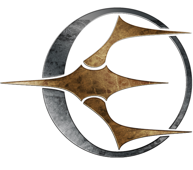
| I still dont like how E looking it is lol Can I work on this tonight and come up with some variations before we settle I agree though I like the overall look! | |
|
| | |
Harlequin2
Veteran Agent
Number of posts : 1887
Age : 29
Registration date : 2009-02-25
| | Subject: Re: Guild Logo/Symbol Tue Aug 24, 2010 11:07 am | |
| Actually I really like how Dy's portrayed it, almost looking like a ringed planet (think Saturn) yet with the starship in front.
I'm in favour of keeping this as our guild logo, but done in shaded gold rather than bold green. | |
|
| | |
PrioryJK
Special Agent
Number of posts : 2575
Age : 37
Location : UK Hull
Registration date : 2009-05-01
| | Subject: Re: Guild Logo/Symbol Tue Aug 24, 2010 12:33 pm | |
| Right I did play around with it and tbh didnt like what i made :p So basically this is a final version I'm happy with the two center prongs are now symetrical (they were slightly uneven before) and I went with the theme of the prongs with a gap between the planet and the right hand prong Dy added. And I embossed it to make it pretty  | |
|
| | |
Sponsored content
| | Subject: Re: Guild Logo/Symbol | |
| |
|
| | |
| | Guild Logo/Symbol | |
|


 E.P.O.C.H Wiki
 HeroMachine 2.5