| | Guild Logo/Symbol |  |
|
+8Caryington PrioryJK The Partisan Kol Charada Lunarwolf Harlequin2 Sureshot 12 posters |
|
| Author | Message |
|---|
Harlequin2
Veteran Agent


Number of posts : 1887
Age : 30
Registration date : 2009-02-25
| | Subject: Re: Guild Logo/Symbol Mon Apr 19, 2010 1:14 pm | |
| Okay, so does that mean we're sticking with the idea above? I would prefer it upright, but it's you're call. I'm not too sure on having it on the Crescent Moon though, the shaded region would take up too much space. I'm like to hear other people's opinions. | |
|
| | |
nosyd
Freelancer


Number of posts : 435
Age : 53
Location : Waddington - Lancashire - England
Registration date : 2009-06-06
| | Subject: Re: Guild Logo/Symbol Mon Apr 19, 2010 1:28 pm | |
| The Trident being on it's side and looking like an E looks really good. | |
|
| | |
PrioryJK
Special Agent


Number of posts : 2575
Age : 37
Location : UK Hull
Registration date : 2009-05-01
| | Subject: Re: Guild Logo/Symbol Mon Apr 19, 2010 1:51 pm | |
| I was wondering if we could slow the progress on this just a notch, I'd really like to contribute with ideas etc but I'm currently tied down with Uni work. I like alot of the images so far but I feel its moving a bit too fast  @%&# slap me if I'm out of line  | |
|
| | |
Sureshot
Chief Operative

Number of posts : 5209
Age : 47
Location : Reading, England
Registration date : 2009-02-11
| | Subject: Re: Guild Logo/Symbol Wed Apr 21, 2010 5:52 am | |
| - Harlequin2 wrote:
- Okay, so does that mean we're sticking with the idea above? I would prefer it upright, but it's you're call. I'm not too sure on having it on the Crescent Moon though, the shaded region would take up too much space. I'm like to hear other people's opinions.
See I actually prefer the crescent moon to the outer circle but I think they'd look good together. - PrioryJK wrote:
- I was wondering if we could slow the progress on this just a notch, I'd really like to contribute with ideas etc but I'm currently tied down with Uni work.
I like alot of the images so far but I feel its moving a bit too fast
@%&# slap me if I'm out of line I'd agree with this to be honest. I would like to see some more ideas and I think once we decide on an image it'll need to be polished up a fair bit anyway. | |
|
| | |
Harlequin2
Veteran Agent
Number of posts : 1887
Age : 30
Registration date : 2009-02-25
| | Subject: Re: Guild Logo/Symbol Fri May 07, 2010 10:49 am | |
| - PrioryJK wrote:
- I was wondering if we could slow the progress on this just a notch, I'd really like to contribute with ideas etc but I'm currently tied down with Uni work.
I like alot of the images so far but I feel its moving a bit too fast
@%&# slap me if I'm out of line See what you did PJK! No-one's posted since the 21st!! Seriously though, has there been any advance on this? | |
|
| | |
Lunarwolf
Chief Operative

Number of posts : 6401
Age : 45
Location : Southampton, UK
Registration date : 2009-02-23
| | Subject: Re: Guild Logo/Symbol Fri Jun 11, 2010 12:55 pm | |
| So true Harl!
Another month has gone by with nothing - NOTHING!
Seriously, we gonna pick this up again any time soon? It'd be a shame to see if fall by the wayside - we need our Galactic Identity! | |
|
| | |
Sureshot
Chief Operative
Number of posts : 5209
Age : 47
Location : Reading, England
Registration date : 2009-02-11
| | Subject: Re: Guild Logo/Symbol Fri Jun 11, 2010 1:09 pm | |
| Yep, I've been wondering about this of late as well. I was looking into the designing of Guild T-Shirts again and I thought a little symbol would look superb on the arm.
I'm definitely looking forward to seeing what the guild has to offer thats for sure. | |
|
| | |
Lunarwolf
Chief Operative
Number of posts : 6401
Age : 45
Location : Southampton, UK
Registration date : 2009-02-23
| | Subject: Re: Guild Logo/Symbol Fri Jun 11, 2010 1:12 pm | |
| I'll see if I can knock a few ideas together tomorrow (it'll give us something else to talk about as well as the new vid  ) | |
|
| | |
PrioryJK
Special Agent
Number of posts : 2575
Age : 37
Location : UK Hull
Registration date : 2009-05-01
| | Subject: Re: Guild Logo/Symbol Fri Jun 11, 2010 1:39 pm | |
| Seriously LW why do we need the guild Logo so urgently Yeah I'll go through some of the previous comments and come up with some ideas for it, sketches etc and post tomorrow its not like I've got anything better to do.. | |
|
| | |
Harlequin2
Veteran Agent
Number of posts : 1887
Age : 30
Registration date : 2009-02-25
| | Subject: Re: Guild Logo/Symbol Fri Jun 11, 2010 1:57 pm | |
| - PrioryJK wrote:
- Seriously LW why do we need the guild Logo so urgently
Guild T-Shirts  (as SS said a few posts up). Also, it's a good way to solidify our place in the ToR community. If you see a Sith Empire logo with a clenched fist on it you think " Hey, that reminds me of the Hands of Darkness!". A visual image can often be a better reminder than words and for that reason alone is it worth pushing this topic. Now please follow up with a hilarious joke because I feel like I've been harsh pushing my opinion | |
|
| | |
Harlequin2
Veteran Agent
Number of posts : 1887
Age : 30
Registration date : 2009-02-25
| |
| | |
Lunarwolf
Chief Operative
Number of posts : 6401
Age : 45
Location : Southampton, UK
Registration date : 2009-02-23
| | Subject: Re: Guild Logo/Symbol Sat Jun 12, 2010 7:55 am | |
| I really like that! Great compromise of ideas I'm still working on my one 'cos I'm not happy with it  | |
|
| | |
PrioryJK
Special Agent
Number of posts : 2575
Age : 37
Location : UK Hull
Registration date : 2009-05-01
| | Subject: Re: Guild Logo/Symbol Sat Jun 12, 2010 8:02 am | |
| I was messing about with the trident idea (ie steal Harls idea ) and though we could try make it a bit abstract so we know its meant to be an E but could be mistook for an symbol? I like that actually Halr not that I didnt like the others but its more abstract and has the planet in shadow 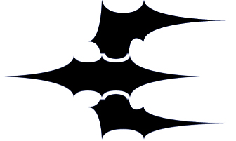  | |
|
| | |
Sureshot
Chief Operative
Number of posts : 5209
Age : 47
Location : Reading, England
Registration date : 2009-02-11
| | Subject: Re: Guild Logo/Symbol Sat Jun 12, 2010 8:04 am | |
| That E looks pretty damn sweet! I like. | |
|
| | |
Lunarwolf
Chief Operative
Number of posts : 6401
Age : 45
Location : Southampton, UK
Registration date : 2009-02-23
| | Subject: Re: Guild Logo/Symbol Sat Jun 12, 2010 8:04 am | |
| LOL I'm just gonna give up for a moment, none of mine look as good as these previous two I'd like to vote for either: * Harl's most recent one (The E trident with outer-rim surround and down-arrow)  or * PJK's most recent one (The "Holly" Trident (as I like to call it) with the two colours inversing/contrasting) | |
|
| | |
PrioryJK
Special Agent
Number of posts : 2575
Age : 37
Location : UK Hull
Registration date : 2009-05-01
| | Subject: Re: Guild Logo/Symbol Sat Jun 12, 2010 8:11 am | |
| Well i'm just working from Harls designs really which i like, for me they dont look very star warsy symbolish as they are so I'm just tinkering around the edges so to speak | |
|
| | |
Lunarwolf
Chief Operative
Number of posts : 6401
Age : 45
Location : Southampton, UK
Registration date : 2009-02-23
| | Subject: Re: Guild Logo/Symbol Sat Jun 12, 2010 8:14 am | |
| Thing is a lot of the "official" star wars symbols for organisations, system-wide authorities and groups don't actually look 'that star warsy', when you compare them to logos like the galactic senate, the sith empire or the republic.
Trying to make them look as such would be a mistake in my opinion anyway, we want to look different, not like something that has gone before. | |
|
| | |
Harlequin2
Veteran Agent
Number of posts : 1887
Age : 30
Registration date : 2009-02-25
| | Subject: Re: Guild Logo/Symbol Sat Jun 12, 2010 8:23 am | |
| I don't think that there's anything wrong with PJK's logo if we're comparing it to Star Wars canon. It actually reminds me of a stealth star fighter! Still, I do have a problem with it in that it is complicated. You could argue otherwise, but to me, it would be hard to make a quick but accurate sketch of it, considering all the spikes and curves. Although, I'm probably biased towards my recent design as well | |
|
| | |
PrioryJK
Special Agent
Number of posts : 2575
Age : 37
Location : UK Hull
Registration date : 2009-05-01
| | Subject: Re: Guild Logo/Symbol Sat Jun 12, 2010 8:27 am | |
| Yeah harl the spikes fail a bit I'm planning to rework your new one to make it look a bit more geometric and less (if any) pointy | |
|
| | |
Harlequin2
Veteran Agent
Number of posts : 1887
Age : 30
Registration date : 2009-02-25
| | Subject: Re: Guild Logo/Symbol Sat Jun 12, 2010 9:01 am | |
| Well, I've used your design with a few tweaks and I think it looks good. Have a peak at it yourselves.  | |
|
| | |
Lunarwolf
Chief Operative
Number of posts : 6401
Age : 45
Location : Southampton, UK
Registration date : 2009-02-23
| | Subject: Re: Guild Logo/Symbol Sat Jun 12, 2010 9:14 am | |
| | |
|
| | |
Harlequin2
Veteran Agent
Number of posts : 1887
Age : 30
Registration date : 2009-02-25
| | Subject: Re: Guild Logo/Symbol Sat Jun 12, 2010 9:33 am | |
| Excellent! Perhaps we've found our logo? Of course, it will need touching up on a better program before we hoist it as our flag (I'm only using paint!) | |
|
| | |
PrioryJK
Special Agent
Number of posts : 2575
Age : 37
Location : UK Hull
Registration date : 2009-05-01
| | Subject: Re: Guild Logo/Symbol Sat Jun 12, 2010 9:36 am | |
| Yeah not bad I'll have a tweak in PS for you harl and come up with something cleaner (less pixelly) | |
|
| | |
Caryington
Veteran Agent

Number of posts : 2420
Age : 41
Location : Watching you...
Registration date : 2010-03-07
| | Subject: Re: Guild Logo/Symbol Sat Jun 12, 2010 12:46 pm | |
| Soude approved, H2! /clap H2 | |
|
| | |
Sureshot
Chief Operative
Number of posts : 5209
Age : 47
Location : Reading, England
Registration date : 2009-02-11
| | Subject: Re: Guild Logo/Symbol Sat Jun 12, 2010 3:26 pm | |
| Bah I can't decide. I'm actually starting to think that it would look better without the bottom "V" shape though. | |
|
| | |
Sponsored content
| | Subject: Re: Guild Logo/Symbol | |
| |
|
| | |
| | Guild Logo/Symbol | |
|


 E.P.O.C.H Wiki
 HeroMachine 2.5
